Data Modeling & Visualization
Here, I have placed several projects that I worked on for reporting significant data insights using PowerBI’s visualization and data modeling capabilities.
Dashboards in PowerBI
I worked on many dashboards in PowerBI and developed the underlying data models. In the visuals below, you can see small sections taken from some dashboards.

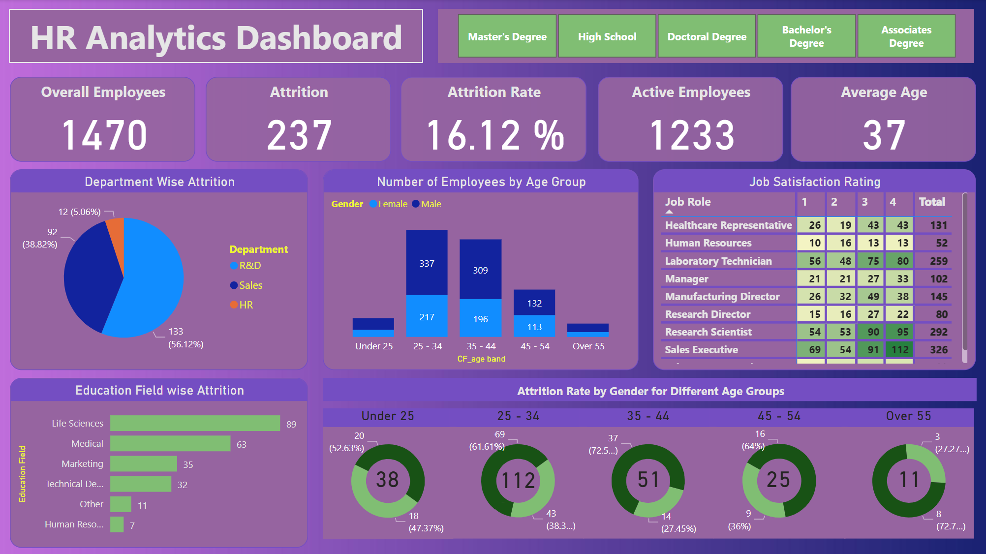
This PowerBI dashboard is an overview of HR analytics for an organization and features the following:
- Overall Employees: The total number of employees in the company.
- Attrition: The total number of employees who have left the company.
- Attrition Rate: The percentage of employees who have left compared to the overall headcount.
- Active Employees: The number of employees currently employed.
- Average Age: The mean age of all employees.
After displaying the above metrics from the data, I made more visuals including:
- Department Wise Attrition: A pie chart that shows the distribution of attrition across different departments.
- Number of Employees by Age Group: A bar chart with the number of employees in certain age ranges, also by gender.
- Job Satisfaction Rating: A table that summarizes job satisfaction scores across different job positions.
- Education Field-wise Attrition: bar chart showing attrition rates by the field of education.
- Attrition Rate by Gender for Different Age Groups: Donut charts showing the attrition rates for different age groups by gender.

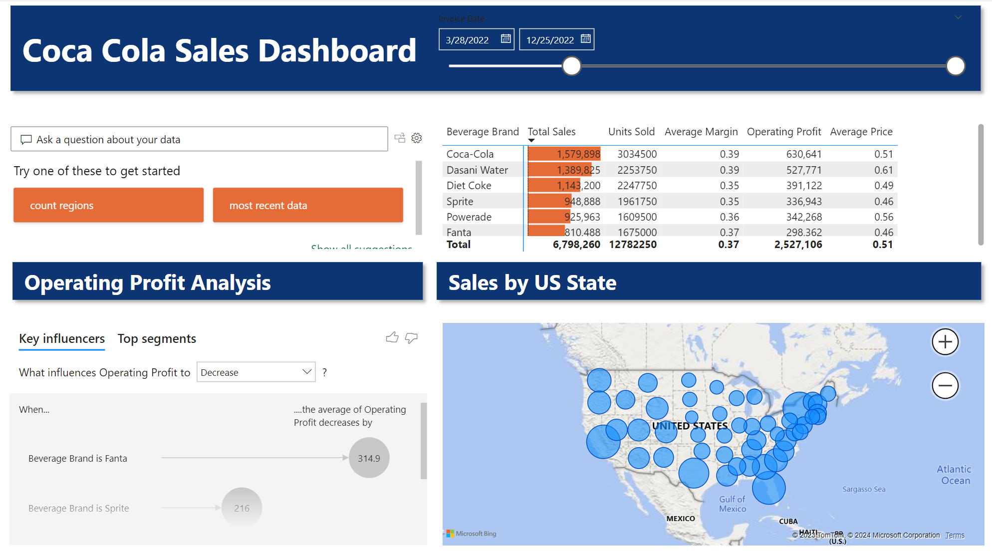
This dashboard visualizes some of the components behind Coca-Cola Sales and features some of the following components:
- Date Filter: Allows users to select the invoice date range for the data being displayed.
- Sales Data Table: Shows sales metrics for different beverage brands including Coca-Cola, Dasani Water, Diet Coke, Sprite, Powerade, and Fanta. Metrics include total sales, units sold, average margin, operating profit, and average price.
- Operating Profit Analysis: Provides an analysis of key influencers and top segments affecting operating profit, with a way to explore what influences changes in operating profit.
- Sales by US State: A map of sales data across the United States with bubble sizes that indicate the volume of sales by state.
Data Models in PowerBI
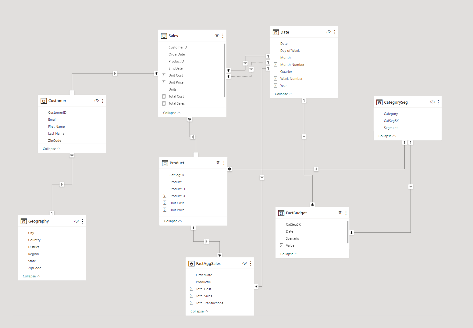
I developed the below data model by first compiling and organizing the raw data in an Excel workbook and loading it into PowerBI where I used the data editor to manipulate and refine the data, creating new columns, relationships, and performing various transformations for cleaning. The goal was to establish the appropriate relationships between the tables.
I used Data Analysis Expressions (DAX) to do complex aggregations, create new metrics, and build the data model to be used for analytical reporting and dashboarding.

Each table is connected with lines representing relationships, which are defined by one-to-one (1:1), one-to-many (1:), or many-to-one (:1) cardinality. The relationships make complex queries across multiple tables easier which then allows multidimensional analysis of sales performance, customer behavior, and budget forecasting.